Catchment insight for independent schools
See where your pupils have come from, year by year, and where your potential pupils live now.


© Mapbox © OpenStreetMap
Which neighbourhoods could be sending us more pupils?
Every neighbourhood has potential pupils: the children whose families could most likely afford fees. Schoolplot shows how many you have from each, how many you'd expect, and which ones could send more. Turn insight into action when planning the next mailing, open morning or nursery visit.

Who else could those families choose?
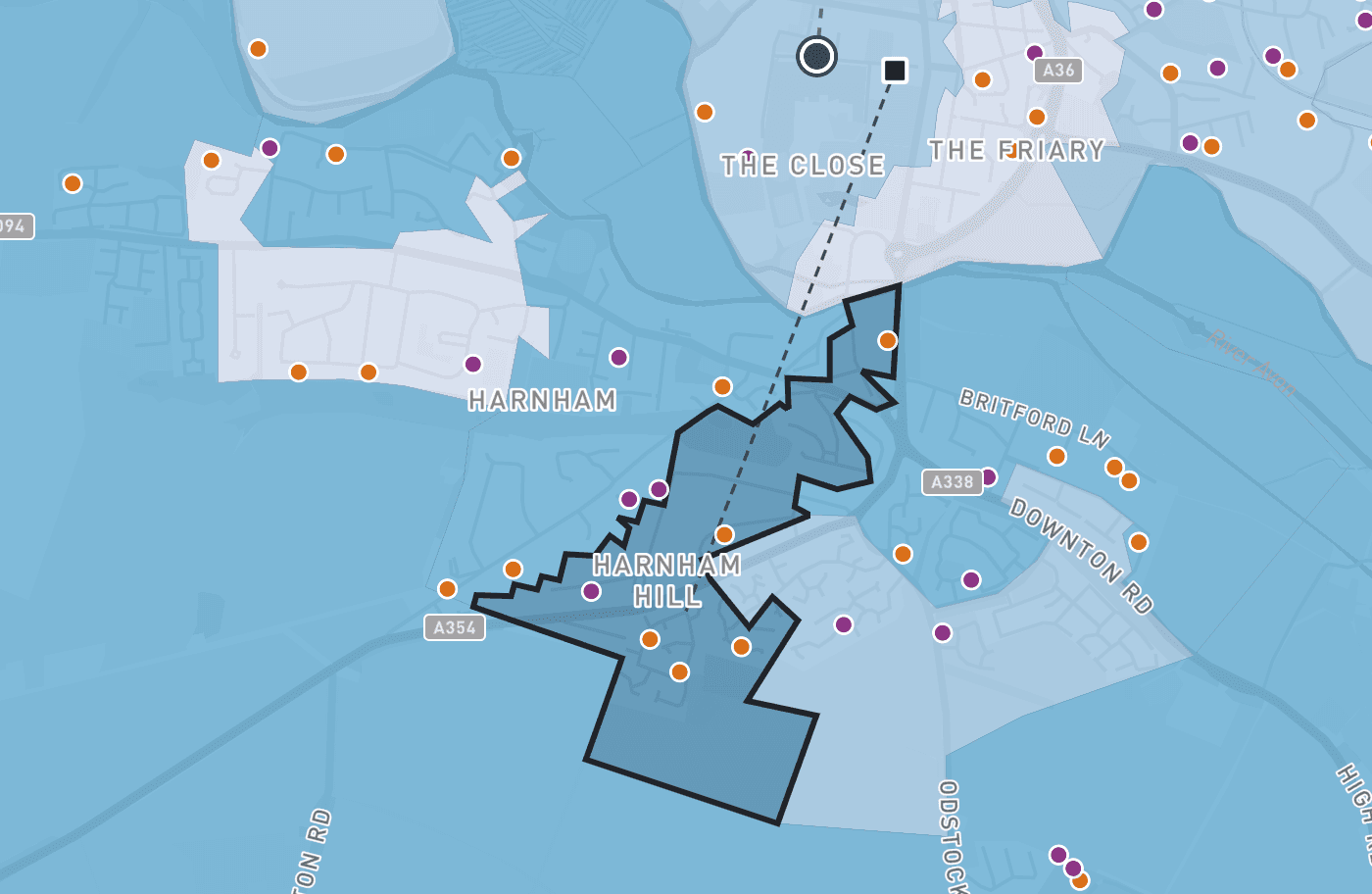
For every neighbourhood, Schoolplot lists the schools that can reach it: independent schools, grammar schools and state schools in the top fifth at GCSE. Each comes with its pupil numbers over recent years, results, demand for places and latest inspection. Weigh the competition before you commit to an area.
© Mapbox © OpenStreetMap
How far will families actually drive to reach us?
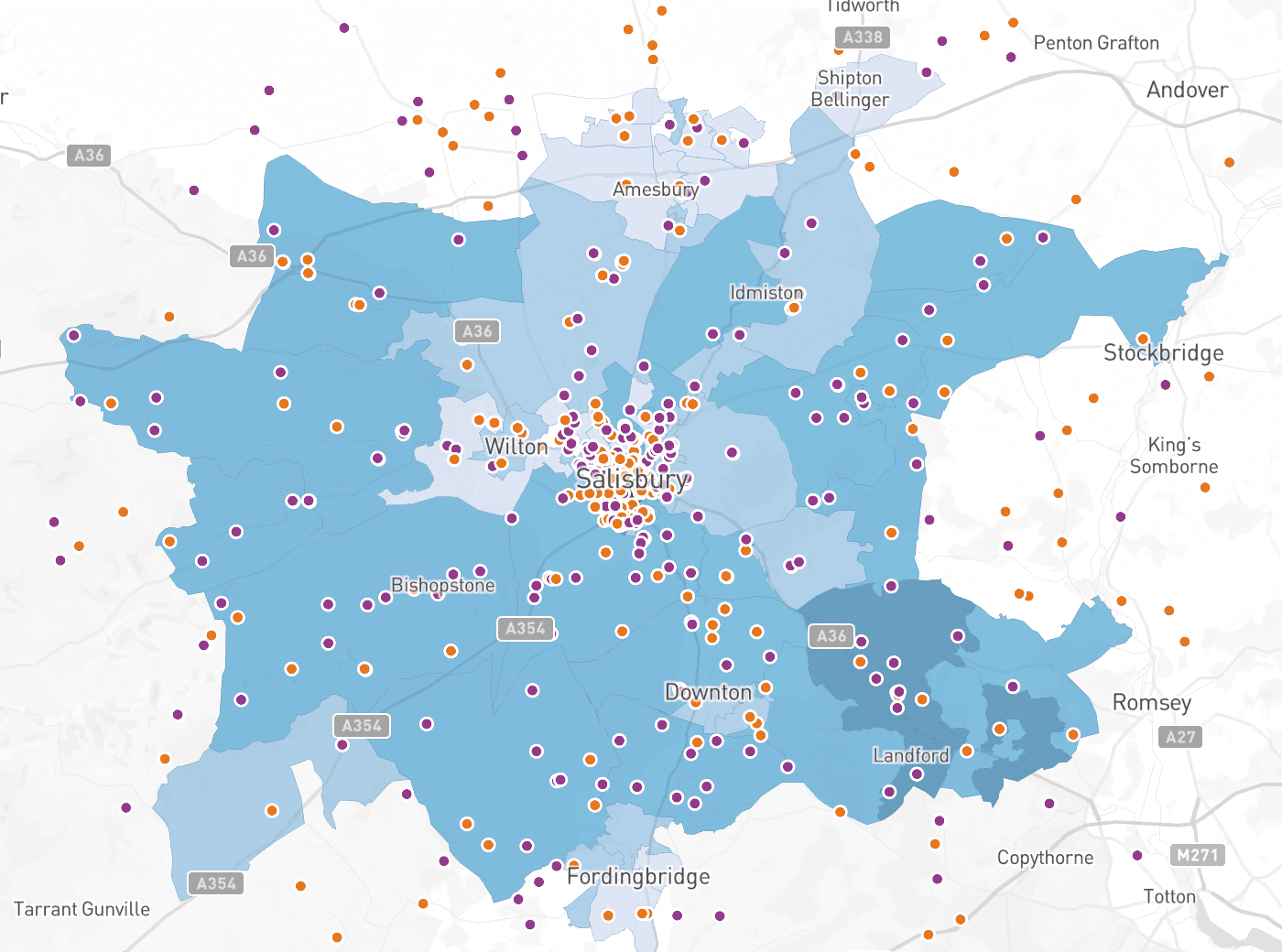
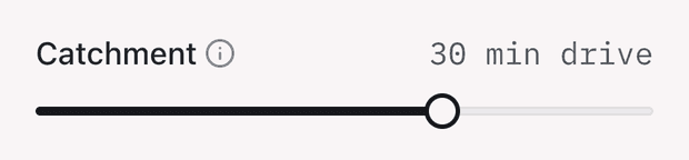
Set the catchment in minutes of driving and see which neighbourhoods fall inside it. Each one carries its drive time to your school, or to each site if you teach on more than one, so a prep campus and a senior school are read separately. Plan the bus route, the open morning or the mailing around how families actually travel.
© Mapbox © OpenStreetMap
Where do our pupils live?
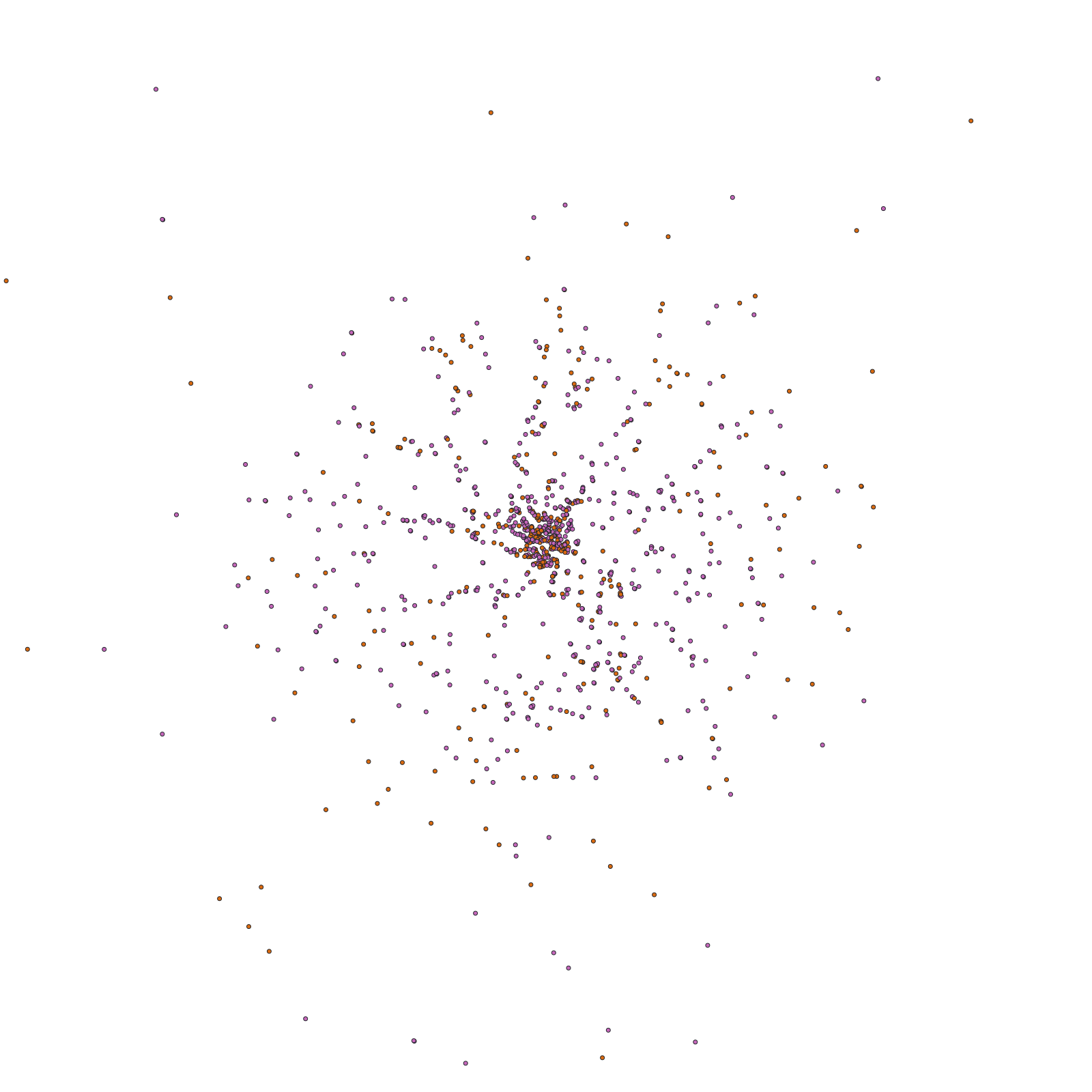
Every pupil, past and present, as a dot at their home postcode, coloured by the stage they're in. Play through the years and watch the catchment move.
Where are we losing pupils from?
Switch to leavers and see where the pupils who left in any year lived. Filter by the year group they left in, to tell the usual exit points from the unusual ones.
Where are we doing better than expected, and where worse?
Actual pupils against expected pupils, for every neighbourhood. Learn from the areas that send more than expected, and look again at the ones that send fewer.
Which year groups are thinning, and from where?
The ISC census shows the entry years falling fastest. Pick any year group, or any range, and see exactly where yours come from.
Where are the families who could afford fees, and the ones who value schooling?
Shade the map by affluence, by education, or by any of the measures behind them, from council tax bands to degree level qualifications.
Where is new demand being built?
A layer for the high value homes built since 2015, and another for the youngest children living in high value homes.
What's the full picture for one neighbourhood?
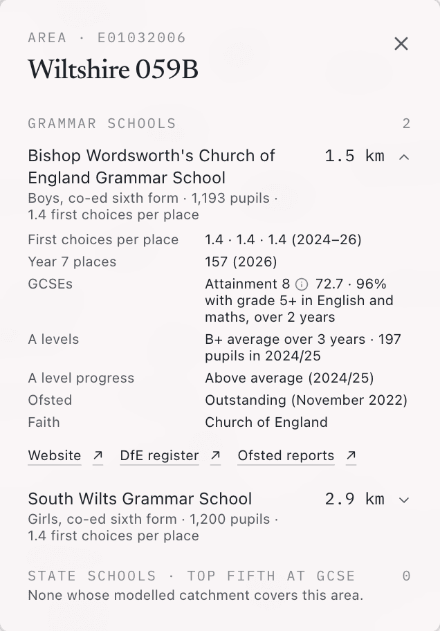
Click it for its demographic profile, your pupils from it year by year, its drive time to your school, and every competing school that can reach it, with each one's pupil numbers, results and inspection.
Ready to make the case?
Export the view on screen as a one page PDF, exactly as you had it, and take it to the Head, the governors or the marketing meeting.
Real pupils, minimal data
Schoolplot runs on your own roster, not a national average. You send an export from your MIS with a pupil reference, a postcode, month and year of birth, and the dates each pupil joined and left, but no names and no full dates of birth. You upload it yourself, and update it whenever you like. It's held under a written data processing agreement. The demographics are official public statistics for every neighbourhood in England, from the latest release of each source. Every layer on the map says where its numbers came from.
About
Schoolplot is made by David Heyman at Axis Maps, a cartography company that has made maps for public health bodies, educational publishers and humanitarian agencies.
Book a demo
Book a demoThe demo runs on a demonstration school, so there's nothing to prepare and no data to bring to the call. Schoolplot is one annual subscription per school.