Insights
What the map tells you.
Pupils
Where your pupils come from.
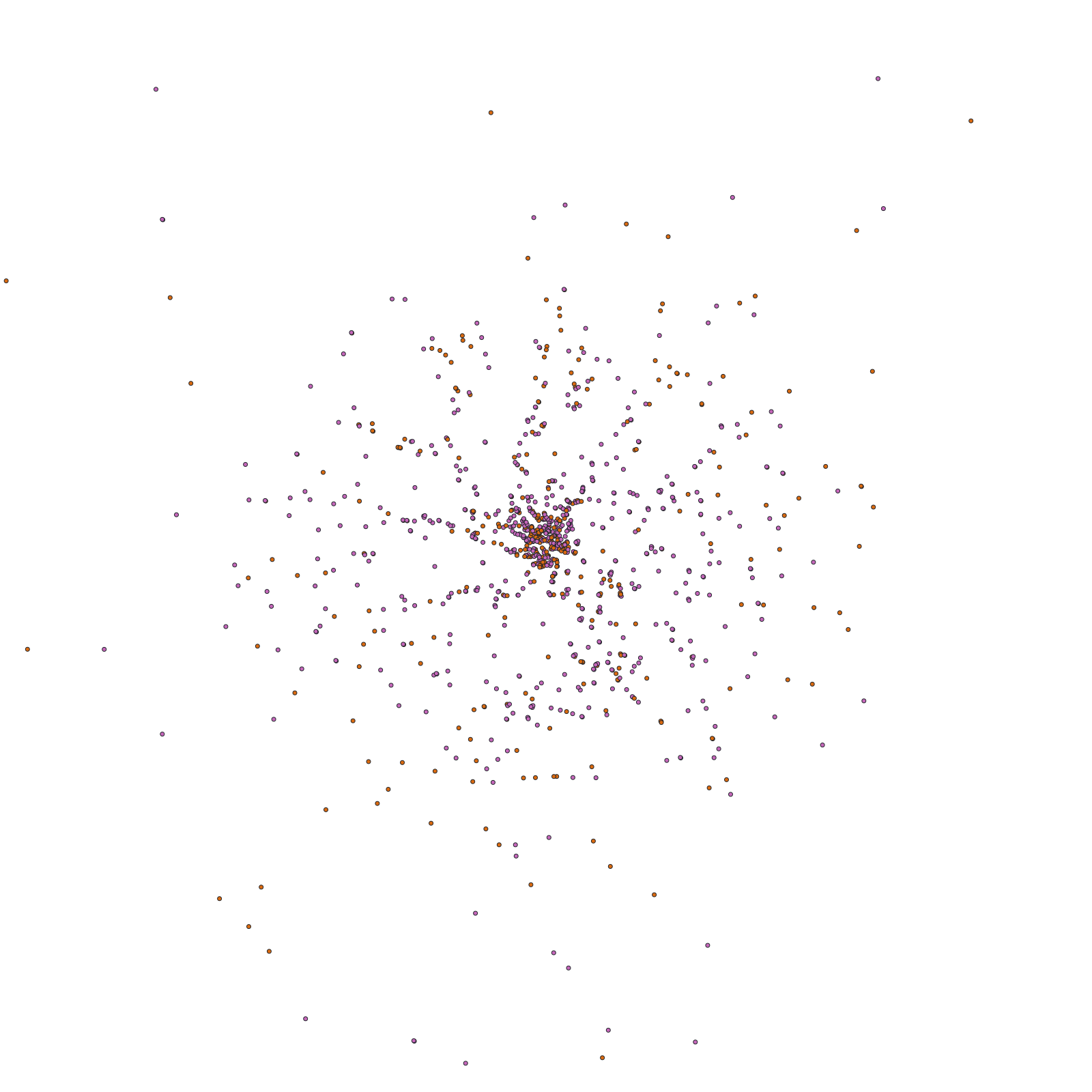
Each dot is a pupil at their home postcode, coloured by the stage they're in. Play through the academic years to watch the catchment grow, shift or thin, or select a range of years to see several intakes at once. A marker shows the average pupil location, so you can see where the centre of your intake is and how far it has moved.
Switch from pupils on roll to leavers and the same map shows where pupils were living when they left. Filter by the year group they left in to tell the usual exit points from the unusual ones.

© Mapbox © OpenStreetMap
Catchment
How far families travel.
Parents choose schools they can get to. Asked why they chose a prep school, parents put location first, ahead of fees and results, and research on school choice in England finds distance is one of the three things parents weigh most. Children travel further as they get older, so a school's reach is different at each stage.
The catchment is set in minutes of driving from the school, in five minute steps. A school that teaches in more than one place has a catchment that reaches from each of its sites.
- 1Schoolsmith parent preference surveys, 2016 and 2025
- 2Burgess, Greaves, Vignoles and Wilson, What Parents Want, University of Bristol, 2009

© Mapbox © OpenStreetMap
Layers
What the neighbourhoods are like.
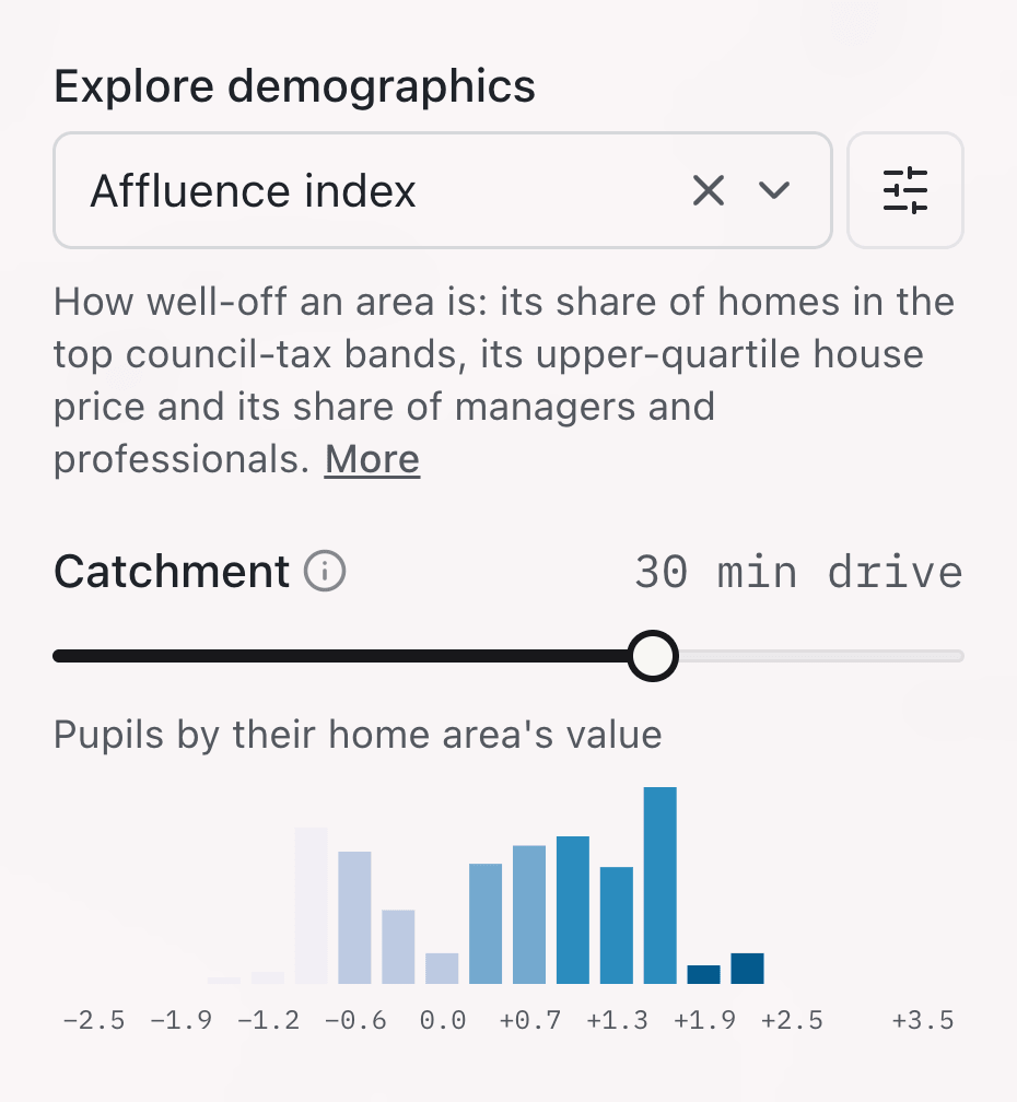
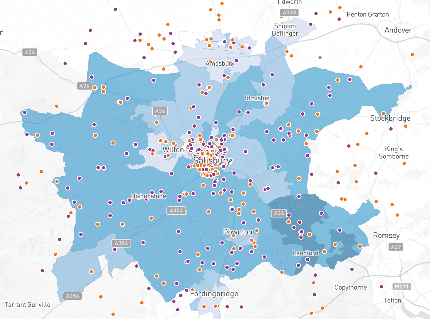
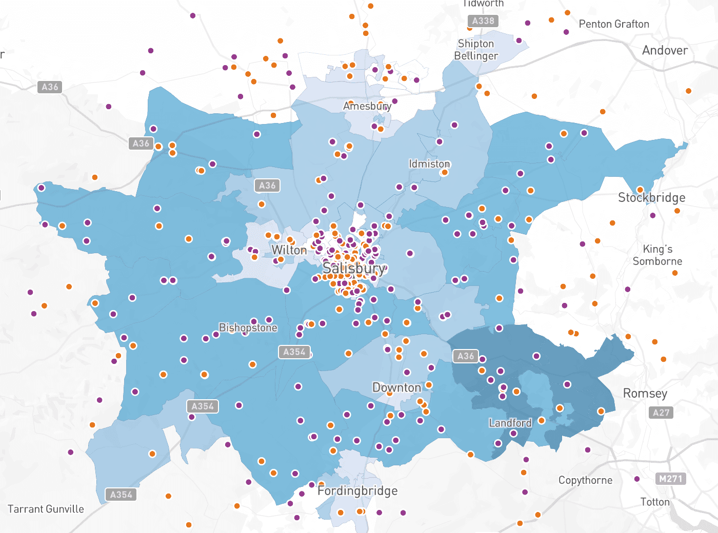
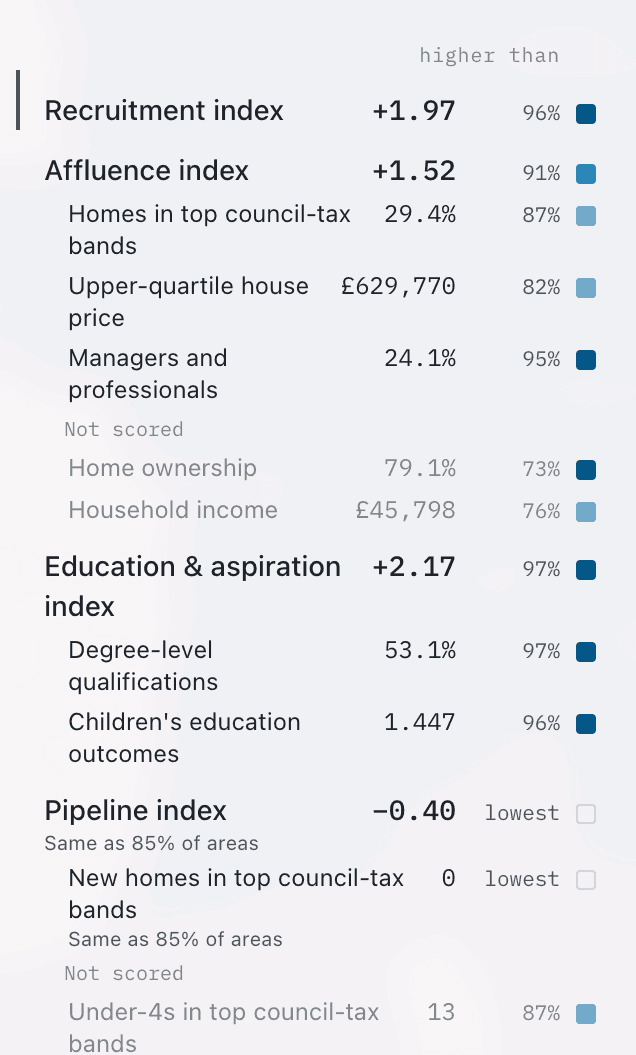
Shade the map by one of four indices, or any of the measures behind them, to see which neighbourhoods have the families most likely to choose a fee-paying school. A histogram shows where your own pupils fall on each layer, so you can see at a glance whether you already recruit from its top end. Weights let you change the influence of each measure. If you know that house prices say more than qualifications about the families you recruit, raise one and lower the other, and the map follows.
Recruitment index
Where the school is most likely to recruit: the average of the Affluence and Education and aspiration indices.
Affluence index
How well off a neighbourhood is: its share of homes in the top council tax bands, its upper quartile house price and its share of managers and professionals.
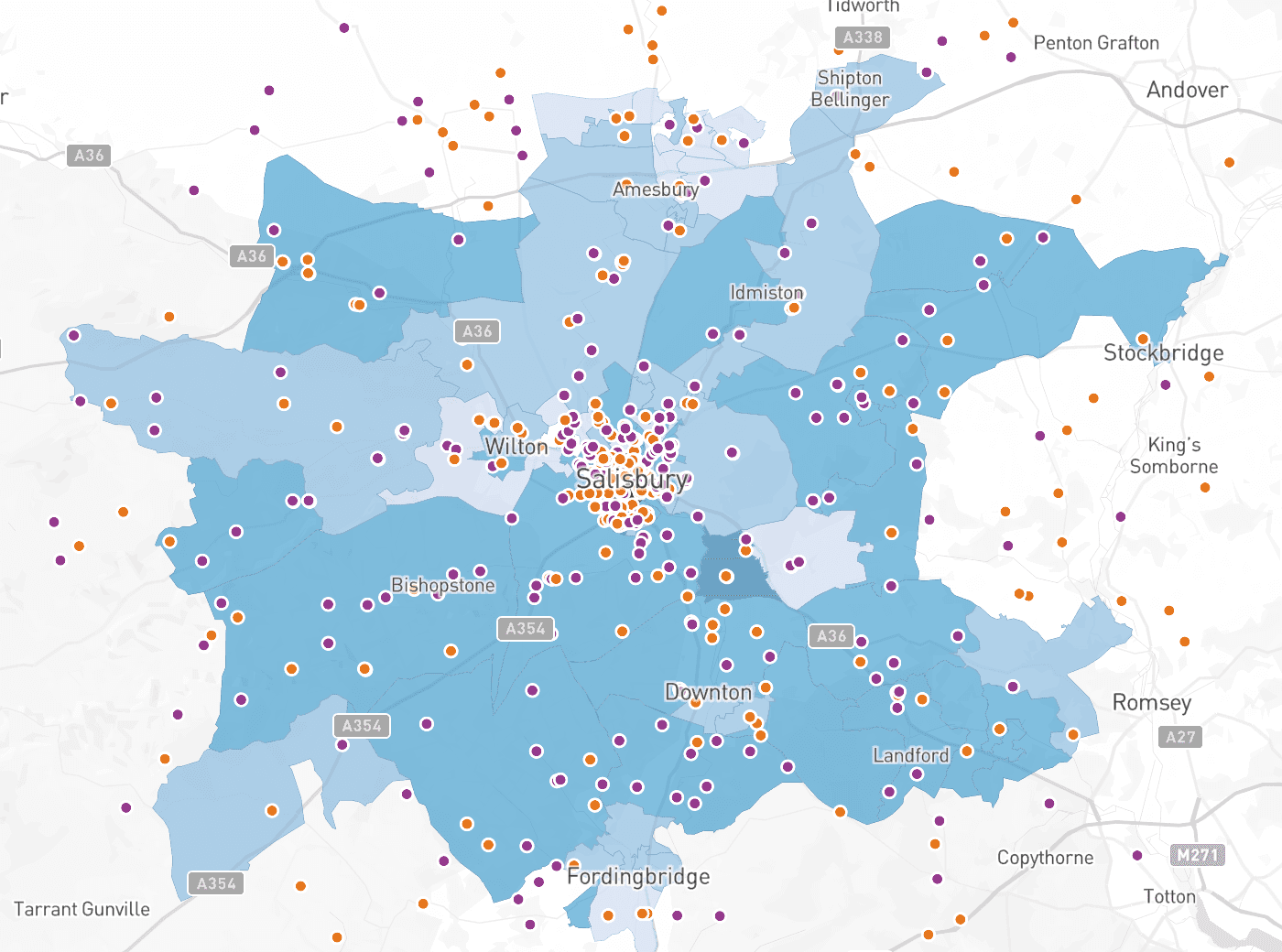
Education and aspiration index
How educated a neighbourhood is and how well its children do at school: its share of adults with degree level qualifications and its children's education outcomes.
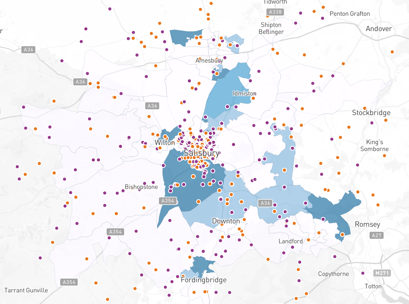
Pipeline index
Future demand from new housing: the number of homes in the top council tax bands built since 2015.
© Mapbox © OpenStreetMap
Potential pupils
Who the potential pupils are.
Not every child in a neighbourhood is a prospect for a fee-paying school, so Schoolplot counts each neighbourhood's potential pupils: an estimate of the children aged 4 to 18 whose families could most likely afford fees, based on how many children live there and the council tax bands of their homes.
The number matters because it sets the scale for everything else. Six pupils is a strong showing from a neighbourhood with fifteen potential pupils, and a weak one from a neighbourhood with sixty. Every neighbourhood's card shows its potential pupils beside the pupils you have from it, and the share that makes.
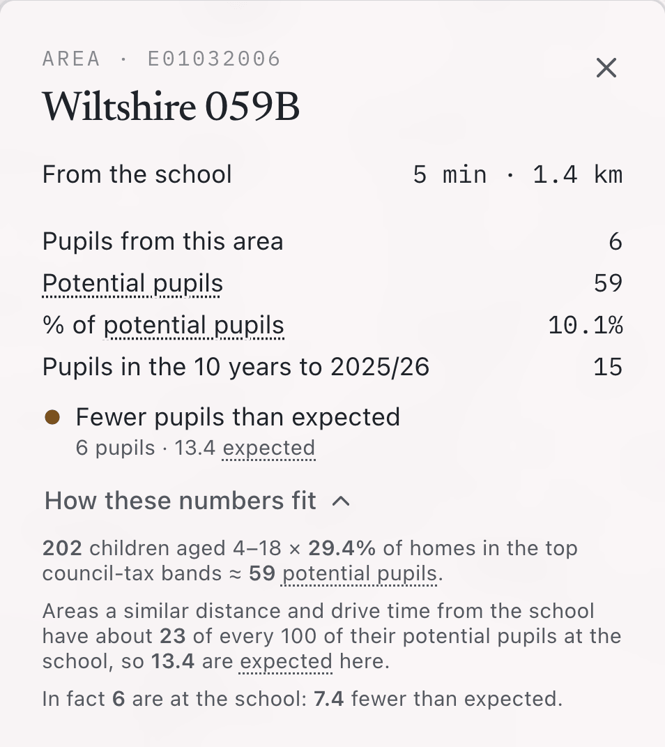
Expected pupils
Where you could have more.
A neighbourhood's expected pupils are how many it would send if its potential pupils joined at the rate seen in others a similar distance and drive time from the school.
The opportunity chart shows the neighbourhoods scoring highest on the layer and picks out those with more or fewer pupils than expected, or none in ten years. Hover any dot for its verdict and its numbers, and click it to open the neighbourhood.

Footprint
Where you have been.
The school footprint shows every neighbourhood that has had a pupil on roll in the ten academic years to the selected year. It is the quickest way to see the edge of your draw, and the villages and estates inside it that have never sent a child.

© Mapbox © OpenStreetMap
Neighbourhood
Everything about one neighbourhood.
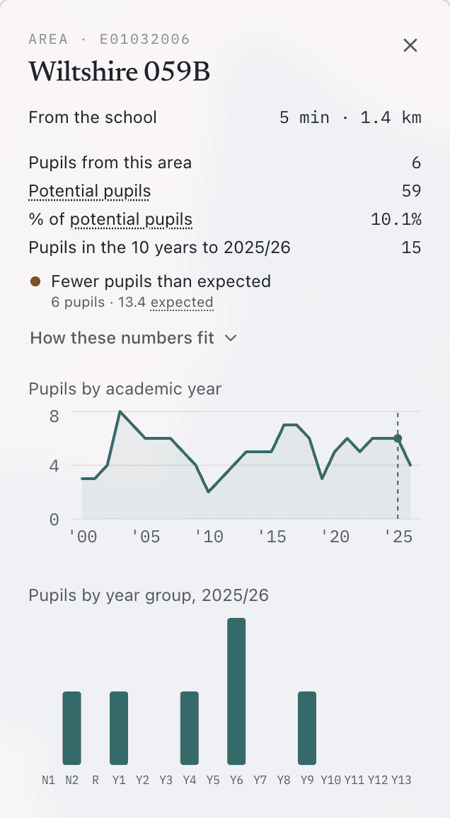
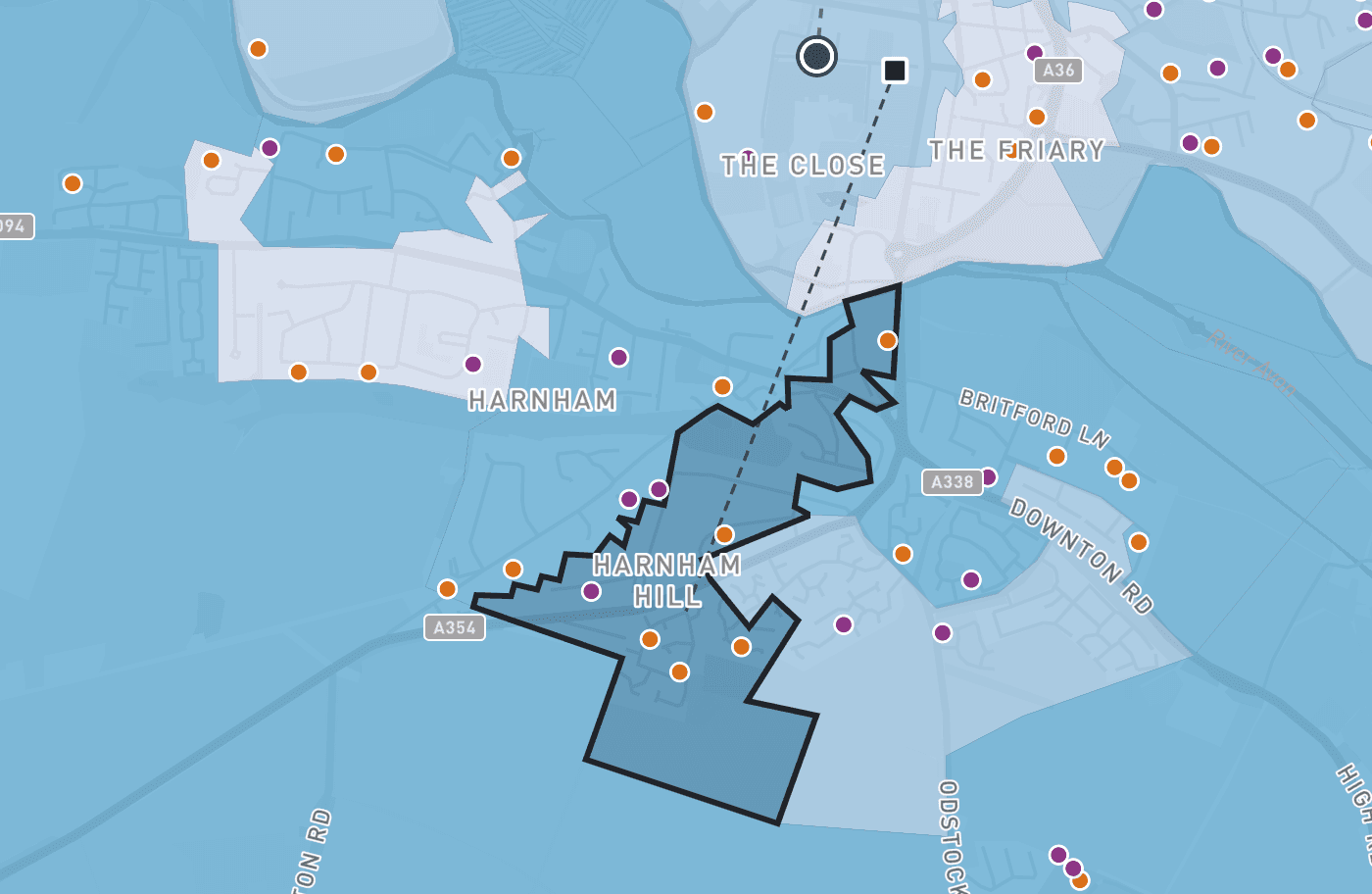
Click any neighbourhood, on the map or on the chart, for its card: its drive time and distance from each site, its pupils by academic year and by year group, its demographic profile on every index and measure, and the schools competing for it.
Under the figures, How these numbers fit works through the neighbourhood's potential, expected and actual pupils with its own numbers.
Rival schools
Who else families could choose.
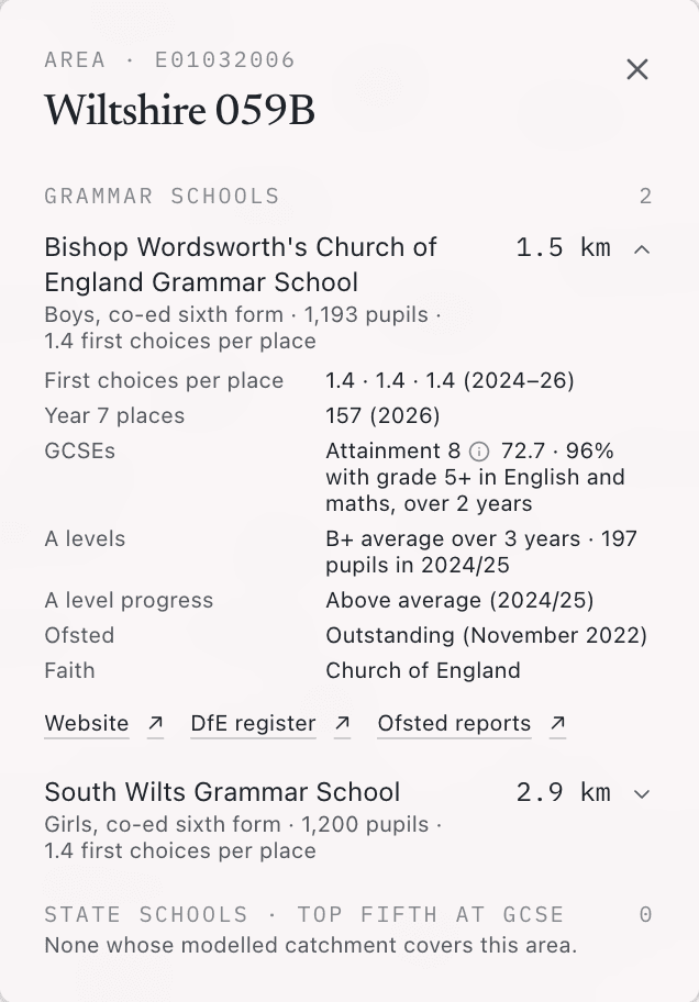
For every neighbourhood, Schoolplot lists the rival schools that can reach it, in three groups: independent schools, grammar schools, and state schools in the national top fifth at GCSE. Each school comes with the facts a family would weigh: boys, girls or co-ed, the year groups it teaches, the number on roll and how it has changed year by year, its results where they are published, demand for its places, and links to its website and inspection reports.
© Mapbox © OpenStreetMap
Share
Take the view with you.
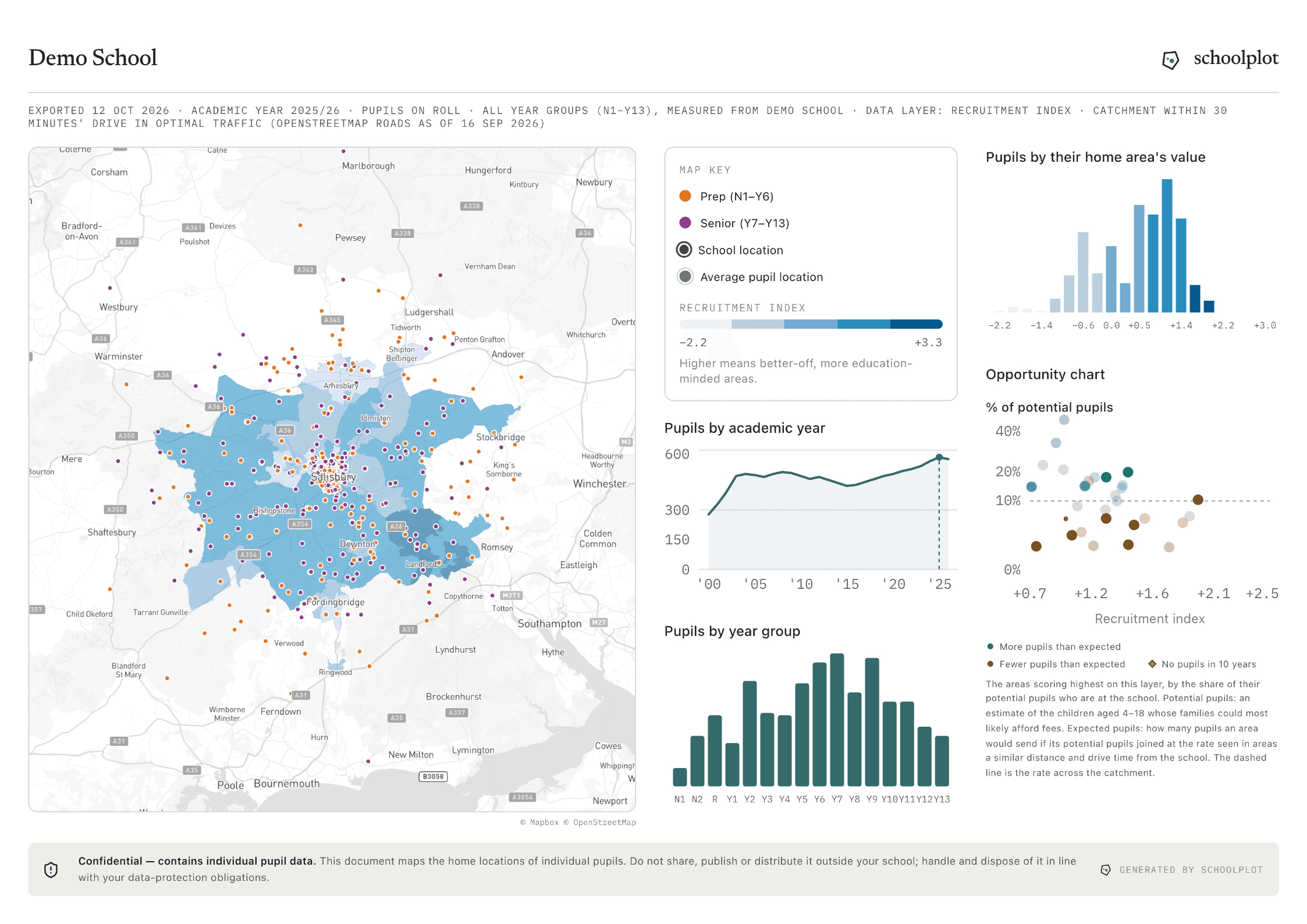
Export the view on screen as a one page PDF designed for print: the map, the legend, the charts and the school's name and crest, dated, ready for the Head, a governors' pack or a marketing meeting. Built in instructions explain the map to anyone new to it.
Book a demo
Book a demoThe demo runs on a demonstration school, so there's nothing to prepare and no data to bring to the call. Schoolplot is one annual subscription per school.